Monday, April 9, 2012

Guest Speaker: MARK RANDALL

Mark Randall, a designer, a principal, and changing the world through designs, came to visit us in our very own St. Cloud State.
On March 17th Mark Randall presented a talk in which he described his designs and his thought towards the designs. As art students some of us go hyper with it, some think way too much, while some can create a master piece. Its about understanding our relation with the work we do, it then starts to find its purpose.

Part I: Design Ignites Change


One is the most powerful number. Its the first value. One person can definitely make a difference. Mark Randall started his presentation with this slide. A very effective way to keep people thinking and focused at the same time.


Our Instructor Keith Christensen and Mark Randall.
1964 brought about the era that has brought a lot of changes in America and all around the world. Time changes and ideas about the world too. Designs brought DADA, and now it should at-least bring few smiles, hope and some REAL good change.
This, A Manifesto: And I Quote:
"By far the greatest time and effort of those working in the advertising industry are wasted on these trivial purpose, which contribute little or nothing to our national prosperity.
I am very sure everyone who is or isn't in designing know President Barack Obama on the poster. I am also sure not everyone could tell why this poster has weird color. It symbolizes, progress, hope and change. It makes sense why this event of a random person holding up that poster is part of his presentation.
Another design made to send a message. After that I personally like the choice of colors.
Charity Water is a non-profit organization who bring clean and safe drinking water to developing countries. A group of very smart people got together and thought of providing clean drinking water and designs were the tools to dig that water up from the earth. Sending this message is a combined effort of other involved people including Mark Randall and Charity Water found Scott Harrison.
World Studios:

Brain: client based, marketing, design+program, services

Heart: collaborative social impact projects

Seymour Chwast, often known as 'the left handed designer.'

The Urban Forest Projected is a series of project. It takes part in different cities of the world. This project was initially started by Worldstudio in the fall of 2006. The project was a much success.
As for the matter of sustainability the banners created were recycled to make unique projects. They were auctioned to raise money. This helped them help around other non-profit organizations.
Design Ignites Change. I saw a patter my brother designed way back when I was only 7. I just had to be able to draw like that; today here I am a majoring in Graphic Design. 
We had to draw, make poster, collages every month as students to hang on our classrooms since our 5th to 10th grade. It provided rivalry with other class sections while letting everyone share different messages among thousands of students.
This images ... I don't think I need to talk about.
Our Guest Speaker, Our Faculty and the Students.


                                                     Part II: Brand Identity System

Our project is based on Brand Identity System. The knowledge of it, and the use of it are two very important things that we learnt in this period. While for our project we worked on a project organized by Minnesota Campus Compact with the sponsorship by State Farms Insurance Company. This project was based on not using cells phones while driving or promoting safe driving habits. We were to design our own Identity System representing the brief 'Driving The Message Home.'
As a part of his visit, Guest Speaker Mark Randall gave us a workshop time. Using this opportunity I have used this chance to make Mark Randall an advocate for this project.


Another Design that speak aloud.
Support Earthquake Reconstruction in Haiti was a message everyone in the world have heard. We all know the incident and how the world acted quickly to help and support them.
Visionary: Future change, these aren't just words. They are green light to move ahead. Provide a helping hand, and need you will for sure get one. A positive miracle needs a positive choice and a positive movement.

Traditional client services:
Non-profit, Civic, Corporate CSR.
They sound like few of the steps to helping and dealing with people you are associated with.
Sappi's Ideas that Matter: provides people with chance to make a chance in the world with their art, promoting influence and giving them a chance to with a huge sum of grant. 
"Today, meaningful work is creating impact ... what will you do tomorrow ... start thinking" ... (sappi)

Started By Pepsi in 2010, The Pepsi Refresh Project. This project has promoted a large number of people and community and non-profit organizations to share messages that make positive impact to the community, world and health.
During his after presentation meeting, he had us learn this much for sure. If you want to make a change start local. I could say its like lifting weights but, anyways ... Small acts inspire big ideas.
Getting us prepped for the next day's workshop.
The workshop process:
- class discussion
- discuss local issues
- create a concept
- communication plan
- budget
- presentation.

March 18th, Our workshop day.
Issue: What are some of the problems facing your community?
Concept: come up with some ideas that address your issue.
Communication: How are you going to execute your project?
Budget: How are you going to found your project?
Our friend Will, speaking out for his group. He was explaining to the class about disrupting boredom, about budget plans. Their topic was STUFF. 
"We are students interested in conglomerated involvement."
  
We are people not beer cans.
Raising awareness of our safety in comparison to our reputation.
The use of 'buzzed light' pictures is a very clever gesture.
Our group of five sat down and agreed to point out an issue that is dear to us. Our issues was cleaning up St. Cloud's downtown. Getting read of trash, cigarette butts, and especially the cracked bottles from the FUN streets. Barefoot Downtown was the name of our project where we'd all get together and share our time volunteering, to keep the parts of city clean. It's be fun and is easy to follow annually. Getting people together with adds and flyers, sponsorship with downtown based businesses, city and non-profit organizations. It's simple and feels good.


St. Cloud Pedestrian Awareness:
"immediate goals include:
- defining bike riding rules
- encouraging pedestrians to give their full attention when crossing roads
- cars to come to full stop around cross walks
- empathy respect between pedestrians, wheelers and bikes
- vehicle taking cross-walking time is not an excuse to breaking the laws.


 After a full 3 hours of handling matters and presenting our cases in the class we felt very delighted in learning something we notice but to not tackle. This workshop was definitely worth it. The best part, was Mark Randall giving us an open invitation to his office in NY.

Videos:
Video I     Video II         Video III         Video IV           Video V 


Thank you for your time. I hope this blog was somehow meaningful as well as helpful. I guess I can say I design in my blogs, and hope this will make an impact someday.

Friday, February 17, 2012

ENGDAHL RICHARDS INC.

        ... So ... it's February 14th and our teacher gave us a real good gift. We got an inside/insight look at Engdahl Richards inc.; "not just a creative and advertise 'junkies' but also strategies and problem solvers."
     With only four members concerning two mentors, Steve Engdahl and Steve Richards and currently two interns from Saint Cloud State University (SCSU), work their time to make things run smoothly. The best part ... they were much more 'cooler' than any professionals I have met and the worst part ... they had no roses ... only heart-sprinkled cookies ... 

 Our class of Art 420 ... busy working on our package for portfolio design. Its a rather big and busy class, the best part is we all get to hear everyone else out. The more heads spinning together the more ideas to 'steal'/share and work with.
Engdahl Richards Inc.(Functional Creative):
Engdahl Richards Inc.
412 37th Avenue North
St. Cloud, MN 56303


I am just simply liking this logo. ORANGE, really? 
Yes, it works! The use of white is very complimentary. 
The 'gears' represent functional.
They do their work off their passion and also for fun. It isn't always about the $$ like big companies that hire and fire people according to their job needs.
Now, I am not saying this cause it's my blog ... I do like it. In fact for my personal logo and portfolio package I choose these colors as well.
Steve 'Caught on camera.'
I took this picture right after I got the 'okay' from our instructor about taking pictures. It was also funny as I had just made a gesture for 'Valentines Day, No Roses?' and Steve said, 'Not that kind of guy!!!'


A lesson learnt is more important the time spent on the work or with the people. After all they are both you teacher in someways. 
This poster for Cold Spring Granite Company says, built on the honestly, integrity, creativity and determination of our employees. This is not just a motto.
... Steve and Glenn were clear about doing the same thing millions of time, but there is no point if your ideas and physical work aren't improving every-time.


This image isn't just representing 'marconet.com' It says the same thing that everyone working there were saying all along. It's not about designing something with your hands and computers. Any idea, decision or design first comes from the head. 
... hear your customers/clients out. Without having a good communication and better understanding of what they want and what you can give them, there is no such thing as a good result. A perfect clap sounds good when Both Hands Slap Together.
Also, we got a free mouse pad ... cheers !

Functional Creative: Just as it says ...
A man walks into a clothing store. The clerk asks, "How can I help you?" The man says, "I need a whole new wardrobe! See this shirt? It's missing a button. Every shit in my closet looks just like this one." The clerk says, "You don't need a new wardrobe. You just need a needle and thread."
THAT'S FUNCTIONAL CREATIVE.
 Well ... this one is here just a joke. The first room in our tour. Honestly, they do have a good restroom ... too bad it's not public.
Engdahl Richards has done a lot of work. When I browsed 'diamond wright' on Google, I saw the same logo. As I clicked it, it went straight to Engdahl Richards' home page.
... know your tools as a designer. Team work is also of importance. The size of the project or the team doesn't matter, nor does the fact of how hard is it to crack the code to the work. Get involved with your work/job. Your responsibility as a designer is much more higher than compared to your job as an employee.
Few of the other poster that I took pictures of. Coolerado is a company based on building air conditioners based in Denver, Colorado.
... it sounded funny when they said Coolerado was based on Colorado. They supply their products all over. Coolerado began with Dr. Valeriy Maisotsenko’s discovery of a new thermodynamic cycle (M-Cycle) illustrating the possibility of using clean and renewable sources of energy found in our atmosphere. To date, Coolerado has 1300 installations across 26 countries on six continents.
Engdahl Richards won the 2011 American Package Design Award.
This award was for 'simplyneutral products labels.'
A cornerstone of Beverly Farms for over thirty years, they have become a destination for high quality wines, hard-to-find labels and boutique wineries. The Cork ‘n Cask and Mark Solomon as owner enjoy a strong relationship with top vintners and distributors, affording them the opportunity to sample and acquire the best wines available. The result is a collection both far-reaching and unique. 
Steve Engdahl, CEO/creative.
I was very impressed with his clear concept about being a designer. I'd like to work with him, because he made us whole bunch of students feel at home. In other words, a place where there is no sense of ego, jobs tend to fold and works tend to finish all by magic.
I really don't think I have to write anything about the picture. I has Steve's permission to take this picture, just to let my friends know that I 'touched' a poster that was signed by the members of Rolling Stones. 
... Steve, if you are reading this, then our plan worked ... I am famous ... yahoo !!!
Glenn Richards, Creative.
He made sure that I caught the picture behind him. I forgot most about what Steve and Glenn said. I mean the important part that we as students could learn. All I remember is, his room was 'yellow' and his joke about his locker that he is thankful for; it actually came handy to him. As I mentioned above in other words, he too is a real 'cool dude.' They are a new and small corporation, but they have relatively wide open minds.

Amy Peterson and Casondra Mrozek.
Both working as interns in Engdahl Richards. Their suggestion was, not to be picky about jobs. In today's market, go with what you got. Gain experience and then the world is yours to explore. The best example to this job was, Amy's print-shop experience and Cassy's interest. It just proves that open mind and pure hard-work gets you anywhere.

Time for fun.
Now ... I am not gonna tell what I did too have the walking on ice experience. Our teacher knows that very well.
This was the welcome site to which Steve and Glenn asked us to go get the shopping cart off the thin ice. Julie had to say, that I should do it ... believe me, it was FfuuuNnNnYy !!!
Also it can be seen from both of their windows.
Finally, a class picture.
I need to invent a flying robot that can take pictures or tap into government satellite.
No one seems to be around, and I am never in the picture ... figures ... should have let Amy take the picture when she offered to. But I am glad I can play the mystery weird, 'which one is me?' game .... !!!

Thank you again for visiting my blog. I am working on more and hope you will enjoy it with as much interest as I put into making them.

Information sources *cited from their respective websites and over the internet.

Friday, January 20, 2012

The WALKER: Graphic Design In Production

t
 As we got done from Periscope, both our classes of Art 420 and Art 422 went over to The Walker Center. "Graphic Design - Now in Production"; I have seen this show before, but I noticed a lot of change. 
Making a mark on the same frame with few different works on display was a very quick challenge.

Since this was my second time touring the show, I decided to take more pictures of new works and limit myself with the older ones.
( http://arwoydigna-keith.blogspot.com/ )
But you have to start with "Graphic Design - Now in Production."
Anthony Burrill:
The contemporary culture of the authority message is the subject of Anthony Burrill's woodblock posters, in which large-scale letterforms spell out messages that admonish or uplift the reader. A more recent variant proclaims "Oil & Water Do Not Mix"; the poster is printed with silkscreen ink made from oil spilled in the 2010 Gulf of Mexico environmental disaster.
Aesthetic Apparatus: Untitled Test Prints, (2002-2007)
... explores the multiplicity of the poster using numerous "make readies" or test print over the years. The overlapping words and images on these prints are the result of overprinting a new poster design atop an old one, thus creating a visual record of different productions runs. Typically discarded in the production process, these prints are preserved and arranged like waterfall, alluding to the torrent and flow of production.
Tweet using #poster-wall to generate a poster. Capture a poster using its unique QR code.
The small kinect (xbox motion detector) lets us to interact with the screen. Our movements are detected and the screen keeps changing its face with poster and other assigned design types.

Museum Boijmans van Beuningen: Mevis & Van Deursen, (identity system, 2003)
"We liked the idea that the building had grown over the years, with new buildings added to older buildings, like a growing architectural collection in itself. As we were into the idea of the museum originally being a combination of two different are collections by former collectors. Mr. Boijmans and Mr. van Beuningen. A double collection." - courtesy the artists.

Marres:
Maureen Moorean, Marres identity system (2007-2011)
Maureen Moorean, Marres In Betwenn: This is Not a Damien Hirst poster (2008)
Located in Maastricht, the Netherlands, Marres is a center for contemporary art that explores different ways that art can appear in relation to the broaded culture. Maureen Mooren designed an identity for Marres that consists of multiple renditions of the center's name. Presented in black and white, most of the logo variants employ drawn or constructed letterforms rather than existing typefaces. Mooren aimed to express the open curatorial program f Marres, countering the notion of a fixed institutional voice.
Martin Wattenberg and Fernanda Vie'gas: History Flow (2003)
Originally created to map changes to articles on Wikipedia, History Flow is a tool for visualizing the evolution of collaboratively created documents and the interactions of multiple contributors.
... this particular flow diagram charts the evolution of the entry on chocolate from the popular websites, with each color representing a different author or editor.

Daniel Eatock:
Utilitarian Poster (1999); Untitled Beatles Poster 02 (2006)
...utilitarian poster compartmentalizes the components of a typical message: time, date, etc. making room for the participation of the user.
...02 renders the lyrics of all the Fab Four's songs on one page, in a form (a poster) ... typically about editing and simplification.

Stedelijk Museum Bureau Amsterdam (SMBA) Dictionary:
Mevis & Van Deursen, SMBA identity system (2003)
Jonathan Puckey, SMBA Dictionary (2006)
"...SMBA enters words in their personal dictionary, the definitions of these words are defined  by the sentences that they appear ... the colors of the words vary from black (no definitions) to bright green (many definitions). The titles at the top of the page are built up using the words in the SMBA dictionary with the same kind of auto-complete functions that is used in SMS."
Philippe Apeloig:
La Lorraine typeface and video (2005)
Crossing the Line: FIAF Fall Festival poster (2010)
French-born designer Philippe Apeloig has worked internationally since the min 1980s. Known for this dynamic use of geometric systems, Apeloig typography that assembles and disassembles into complex layers of form.

Oded Ezer: (Israel)
Tipografya poster (2003); Helvetica Live! poster (2008)
...created typography that appears to morph and grow into natural or mechanical creatures. Whether exploiting the calligraphic nature of Hebrew letterforms r decomposing the mass-produced characters of Helvetica, Ezer brings typography to life in a visceral and surprising way.
"The term Biotypography refers to any application that uses biological system, living organisms, or derivatives thereof to create or modify typographical phenomena."
SALT:
Project Projects, SALT identity system (2011)
Timo Gaessner, Kralice typeface for SALT identity system (2011)
... a cultural institution in Istanbul, avoids the idea of a logo altogether, customizing typeface whose letters S, A, L and T have missing parts. As the identity system lives on, Project Projects will invite designers and typographers to create new alterations to Kralice.
Farhad Fozouni:
Moshajjar poster (2007), courtesy Mirak Gallery
7 Commandments for Becoming Contemporary poster (2008), courtesy Visual Theater Group
Born and based in Tehran, Farhad Fozouni explores in a contemporary manner the organic curves of calligraphy as well as the linear structures seen in traditional Persian books and prints.
Tuatoe, Marshall, Jeanie and Me ... simply super-models.
I think the Super-model theme has gone too far. Its good that our instructor Keith Christensen always there to keep us updated.
Brand New
Armin Vit and Bryony Gomez-Palacio, Brand New: Before and After (2006-2011).
Since this was already a part of my older blog, I decided to put the yellow button on the middle and re-captured the rebel piece myself. Its fun doing "your own" work time-to-time.
Catalogtree:
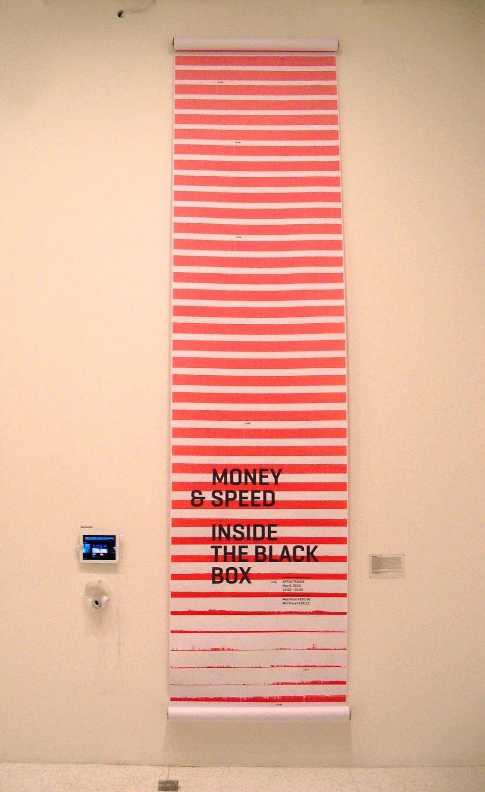
Daniel Gross and Joris Maltha in collaboration with Marjie Meerman, Luts Issler and Jorn van Dijk, Speed & Money: Inside the Black Box (2011)
On May 6, 2010, at 2:42pm, the DOW Jones Industrial Average began to plunge more than 300 points with another 600-point drop in the next five minutes, losing nearly 1,000 points... VPRO, the Dutch television company, produced a documentary by Marjie Meerman entitled Money & Speed: Inside the Black Box to explain what happened that day. The companion TouchDoc app for device such as the iPad was designed by Catalogtree; it merges information graphics and data visualizations with cinematic storytelling.
Sarah Illenberger:
"The Great Sex Survey," Neon Magazine (2008)
Berlin-based illustrator Sarah Illenberger creates physical and then photographs them, yielding mysterious, witty graphics that hover between fiction and reality. To illustrate a survey about sexual practices published by Neon magazine, Illenberger created suggestive arrangements of vegetables, zippers, piles of underwear, and other ordinary objects.

David McCandless:
Mountains Out of Molehills: A Timeline of Global Media Scare Stories (2009)
...tracks various 21st-century media scares, footnoting the intensity of the news coverage with the surprisingly low number of reported death linked to each one.

David McCandless:
Billion Dollar-o-gram (2009)
...uses simple rectangles to compare the dollar value of various contemporary business, wars, and institution. Readers can visually compare, for example, revenues, profits, cost of war, etc.

New York Times Graphics Department.
... of all the collections, the destruction in Japan was the news that got me freaked out. The incident appeared on the paper on the same day as my birthday date.
Jonathan Puckey and Roel Wouters:
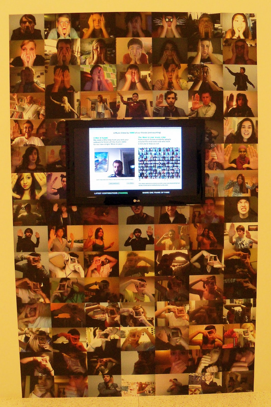
One Frame of Fame (2010)
...viewers can select frames of the video that accompany the song "More or Less", shoot a replacement frame, and upload the result. More than 34,000 users have posed in front of their webcams, contributing a piece of themselves to the collective whole. The project's philosophical gravity falls somewhere between Jean-Luc Godard's claim that cinema is truth 24 times per second and Andy Warhol's prediction that everyone will be famous for 15 minutes.
The Church of London, A Magazine Is Born:
The Making of Little White Lies (2010)
...video running time 1:55 minutes.
Typography:
...among the latest developments are digital tools and effects that allow users to customize their lettering on the fly, often to dramatic effect.

kohinoormultuscript
Satya Rajpurohit: Indian Type Foundry (2010-2011)
...supports seven scripts including Bengali', Devanagari' (Nepali script as well), Gujrati', Gurmukhi', Latin', Malayalam', and Tamil'. Each family comes in at least five styles (light, Book, Regular, Medium, and Bold) and has full support for the conjuncts and ligatures.


Christoper Clark:
Web Typography for Lonely: Triangulate poster (2011)
 I had to introduce our classes on the screen.
Clusters converts each letterform into an array of points and then substitutes the points with graphics shapes.
Christopher Clark:
Web Typographer for Lonely: Cluster poster (2011)
The shapes can be programmed to do things such as float away on mouse-over.
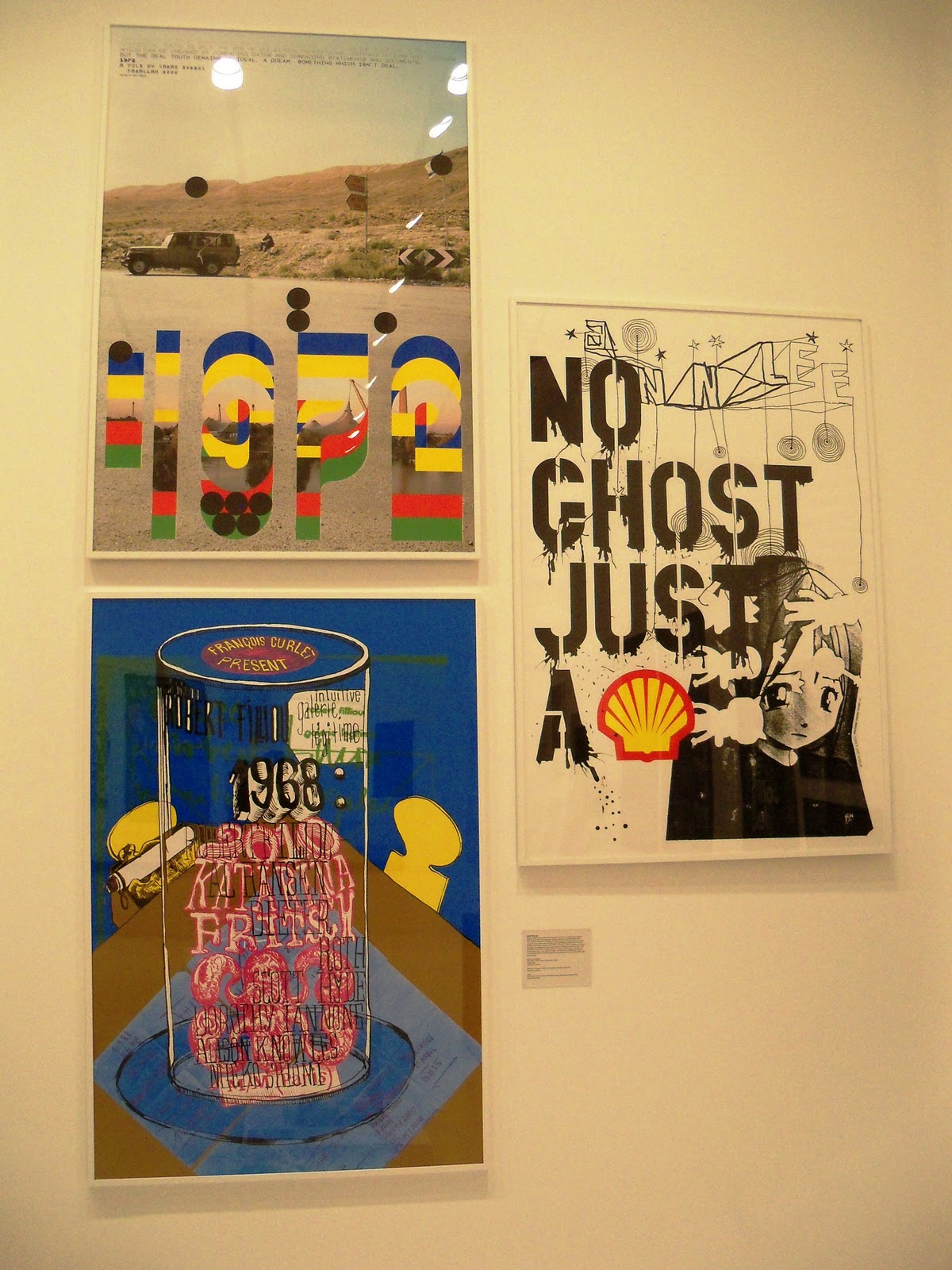
M/M (Paris)
- 1972 A film by Sarah Morris (2008), Paralax Films
- Francois Curlet: Intuitive Galerie Le'gitime poster (2010)
- No Ghost Just a Shell [Pierre Huyghe and Philippe Parreno] (2000)


Craig Ward and Sean Freeman:
- Craig Ward and Sean Freeman, The Future (2008)
- Craig Ward, You Blow Me Away (2009)
- Craig Ward, Super Collider (2010)


Eric Ku:
Chair/Chair (2009)
...is made from pieces that when taken apart, spell out the word 'chair.' Ku was inspired by a famous work by conceptual artist Joseph Kosuth, One and Three Chairs (1965). Kosuth places a new chair in the gallery next to a photograph of the same chair (photographed in that gallery) and a definition from a dictionary.


At the end of the day, everyone sat down for a nice chat reflecting over the days tour. We shared our experiences touring over 5 different places combining two of our classes' trip on the same day.
Finally ... after getting back home I hung up the WALKER sign on the same branch that had the sing from our older field trip. Hope to make this tree full of its personal bling-blings.


And that concludes our trip for the day. Hope you enjoyed my blog ... and I want to create more of these.