As we got done from Periscope, both our classes of Art 420 and Art 422 went over to The Walker Center. "Graphic Design - Now in Production"; I have seen this show before, but I noticed a lot of change.
Making a mark on the same frame with few different works on display was a very quick challenge.

Since this was my second time touring the show, I decided to take more pictures of new works and limit myself with the older ones.
( http://arwoydigna-keith.blogspot.com/ )
But you have to start with "Graphic Design - Now in Production."
( http://arwoydigna-keith.blogspot.com/ )
But you have to start with "Graphic Design - Now in Production."

Anthony Burrill:
The contemporary culture of the authority message is the subject of Anthony Burrill's woodblock posters, in which large-scale letterforms spell out messages that admonish or uplift the reader. A more recent variant proclaims "Oil & Water Do Not Mix"; the poster is printed with silkscreen ink made from oil spilled in the 2010 Gulf of Mexico environmental disaster.
The contemporary culture of the authority message is the subject of Anthony Burrill's woodblock posters, in which large-scale letterforms spell out messages that admonish or uplift the reader. A more recent variant proclaims "Oil & Water Do Not Mix"; the poster is printed with silkscreen ink made from oil spilled in the 2010 Gulf of Mexico environmental disaster.

Aesthetic Apparatus: Untitled Test Prints, (2002-2007)
... explores the multiplicity of the poster using numerous "make readies" or test print over the years. The overlapping words and images on these prints are the result of overprinting a new poster design atop an old one, thus creating a visual record of different productions runs. Typically discarded in the production process, these prints are preserved and arranged like waterfall, alluding to the torrent and flow of production.
... explores the multiplicity of the poster using numerous "make readies" or test print over the years. The overlapping words and images on these prints are the result of overprinting a new poster design atop an old one, thus creating a visual record of different productions runs. Typically discarded in the production process, these prints are preserved and arranged like waterfall, alluding to the torrent and flow of production.

Tweet using #poster-wall to generate a poster. Capture a poster using its unique QR code.
The small kinect (xbox motion detector) lets us to interact with the screen. Our movements are detected and the screen keeps changing its face with poster and other assigned design types.
The small kinect (xbox motion detector) lets us to interact with the screen. Our movements are detected and the screen keeps changing its face with poster and other assigned design types.

"We liked the idea that the building had grown over the years, with new buildings added to older buildings, like a growing architectural collection in itself. As we were into the idea of the museum originally being a combination of two different are collections by former collectors. Mr. Boijmans and Mr. van Beuningen. A double collection." - courtesy the artists.

Marres:
Maureen Moorean, Marres identity system (2007-2011)
Maureen Moorean, Marres In Betwenn: This is Not a Damien Hirst poster (2008)
Located in Maastricht, the Netherlands, Marres is a center for contemporary art that explores different ways that art can appear in relation to the broaded culture. Maureen Mooren designed an identity for Marres that consists of multiple renditions of the center's name. Presented in black and white, most of the logo variants employ drawn or constructed letterforms rather than existing typefaces. Mooren aimed to express the open curatorial program f Marres, countering the notion of a fixed institutional voice.

Martin Wattenberg and Fernanda Vie'gas: History Flow (2003)
Originally created to map changes to articles on Wikipedia, History Flow is a tool for visualizing the evolution of collaboratively created documents and the interactions of multiple contributors.
... this particular flow diagram charts the evolution of the entry on chocolate from the popular websites, with each color representing a different author or editor.

Utilitarian Poster (1999); Untitled Beatles Poster 02 (2006)
...utilitarian poster compartmentalizes the components of a typical message: time, date, etc. making room for the participation of the user.
...02 renders the lyrics of all the Fab Four's songs on one page, in a form (a poster) ... typically about editing and simplification.

Mevis & Van Deursen, SMBA identity system (2003)
Jonathan Puckey, SMBA Dictionary (2006)
"...SMBA enters words in their personal dictionary, the definitions of these words are defined by the sentences that they appear ... the colors of the words vary from black (no definitions) to bright green (many definitions). The titles at the top of the page are built up using the words in the SMBA dictionary with the same kind of auto-complete functions that is used in SMS."

La Lorraine typeface and video (2005)
Crossing the Line: FIAF Fall Festival poster (2010)
French-born designer Philippe Apeloig has worked internationally since the min 1980s. Known for this dynamic use of geometric systems, Apeloig typography that assembles and disassembles into complex layers of form.

Oded Ezer: (Israel)
Tipografya poster (2003); Helvetica Live! poster (2008)
...created typography that appears to morph and grow into natural or mechanical creatures. Whether exploiting the calligraphic nature of Hebrew letterforms r decomposing the mass-produced characters of Helvetica, Ezer brings typography to life in a visceral and surprising way.
"The term Biotypography refers to any application that uses biological system, living organisms, or derivatives thereof to create or modify typographical phenomena."

Project Projects, SALT identity system (2011)
Timo Gaessner, Kralice typeface for SALT identity system (2011)
... a cultural institution in Istanbul, avoids the idea of a logo altogether, customizing typeface whose letters S, A, L and T have missing parts. As the identity system lives on, Project Projects will invite designers and typographers to create new alterations to Kralice.

Farhad Fozouni:
Moshajjar poster (2007), courtesy Mirak Gallery
Moshajjar poster (2007), courtesy Mirak Gallery
7 Commandments for Becoming Contemporary poster (2008), courtesy Visual Theater Group
Born and based in Tehran, Farhad Fozouni explores in a contemporary manner the organic curves of calligraphy as well as the linear structures seen in traditional Persian books and prints.
Born and based in Tehran, Farhad Fozouni explores in a contemporary manner the organic curves of calligraphy as well as the linear structures seen in traditional Persian books and prints.

Tuatoe, Marshall, Jeanie and Me ... simply super-models.

I think the Super-model theme has gone too far. Its good that our instructor Keith Christensen always there to keep us updated.

Brand New
Armin Vit and Bryony Gomez-Palacio, Brand New: Before and After (2006-2011).
Since this was already a part of my older blog, I decided to put the yellow button on the middle and re-captured the rebel piece myself. Its fun doing "your own" work time-to-time.Armin Vit and Bryony Gomez-Palacio, Brand New: Before and After (2006-2011).

Catalogtree:
Daniel Gross and Joris Maltha in collaboration with Marjie Meerman, Luts Issler and Jorn van Dijk, Speed & Money: Inside the Black Box (2011)
Daniel Gross and Joris Maltha in collaboration with Marjie Meerman, Luts Issler and Jorn van Dijk, Speed & Money: Inside the Black Box (2011)
On May 6, 2010, at 2:42pm, the DOW Jones Industrial Average began to plunge more than 300 points with another 600-point drop in the next five minutes, losing nearly 1,000 points... VPRO, the Dutch television company, produced a documentary by Marjie Meerman entitled Money & Speed: Inside the Black Box to explain what happened that day. The companion TouchDoc app for device such as the iPad was designed by Catalogtree; it merges information graphics and data visualizations with cinematic storytelling.

"The Great Sex Survey," Neon Magazine (2008)
Berlin-based illustrator Sarah Illenberger creates physical and then photographs them, yielding mysterious, witty graphics that hover between fiction and reality. To illustrate a survey about sexual practices published by Neon magazine, Illenberger created suggestive arrangements of vegetables, zippers, piles of underwear, and other ordinary objects.

David McCandless:
Mountains Out of Molehills: A Timeline of Global Media Scare Stories (2009)
Mountains Out of Molehills: A Timeline of Global Media Scare Stories (2009)
...tracks various 21st-century media scares, footnoting the intensity of the news coverage with the surprisingly low number of reported death linked to each one.

David McCandless:
Billion Dollar-o-gram (2009)
...uses simple rectangles to compare the dollar value of various contemporary business, wars, and institution. Readers can visually compare, for example, revenues, profits, cost of war, etc.
...uses simple rectangles to compare the dollar value of various contemporary business, wars, and institution. Readers can visually compare, for example, revenues, profits, cost of war, etc.

New York Times Graphics Department.
... of all the collections, the destruction in Japan was the news that got me freaked out. The incident appeared on the paper on the same day as my birthday date.
... of all the collections, the destruction in Japan was the news that got me freaked out. The incident appeared on the paper on the same day as my birthday date.
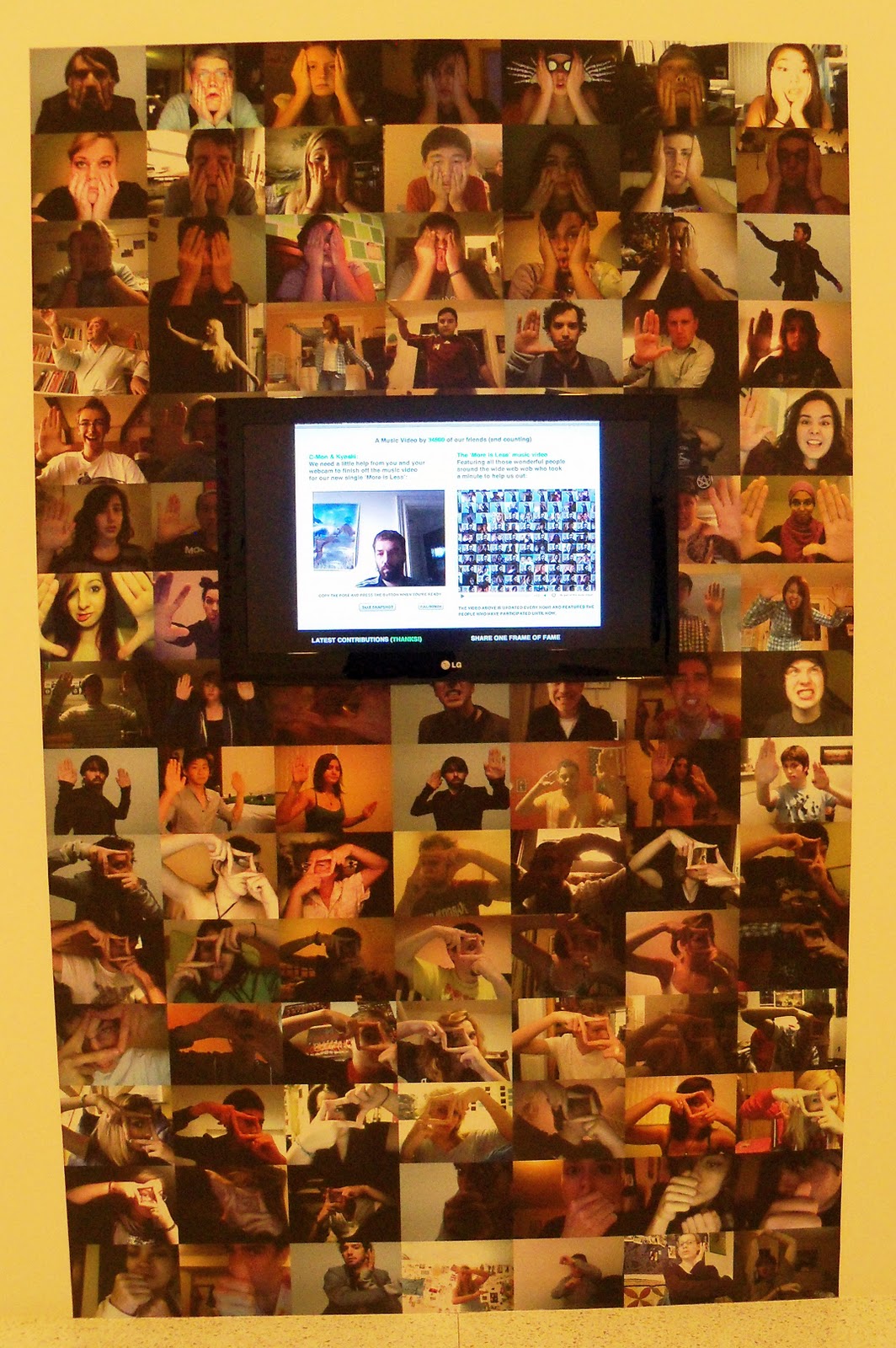
Jonathan Puckey and Roel Wouters:
One Frame of Fame (2010)
...viewers can select frames of the video that accompany the song "More or Less", shoot a replacement frame, and upload the result. More than 34,000 users have posed in front of their webcams, contributing a piece of themselves to the collective whole. The project's philosophical gravity falls somewhere between Jean-Luc Godard's claim that cinema is truth 24 times per second and Andy Warhol's prediction that everyone will be famous for 15 minutes.

The Church of London, A Magazine Is Born:
The Making of Little White Lies (2010)
The Making of Little White Lies (2010)
...video running time 1:55 minutes.

Typography:
...among the latest developments are digital tools and effects that allow users to customize their lettering on the fly, often to dramatic effect.
...among the latest developments are digital tools and effects that allow users to customize their lettering on the fly, often to dramatic effect.


kohinoormultuscript
Satya Rajpurohit: Indian Type Foundry (2010-2011)
...supports seven scripts including Bengali', Devanagari' (Nepali script as well), Gujrati', Gurmukhi', Latin', Malayalam', and Tamil'. Each family comes in at least five styles (light, Book, Regular, Medium, and Bold) and has full support for the conjuncts and ligatures.
Christoper Clark:
Web Typography for Lonely: Triangulate poster (2011)
I had to introduce our classes on the screen.
Clusters converts each letterform into an array of points and then substitutes the points with graphics shapes.

Christopher Clark:
Web Typographer for Lonely: Cluster poster (2011)
The shapes can be programmed to do things such as float away on mouse-over.
Web Typographer for Lonely: Cluster poster (2011)
The shapes can be programmed to do things such as float away on mouse-over.
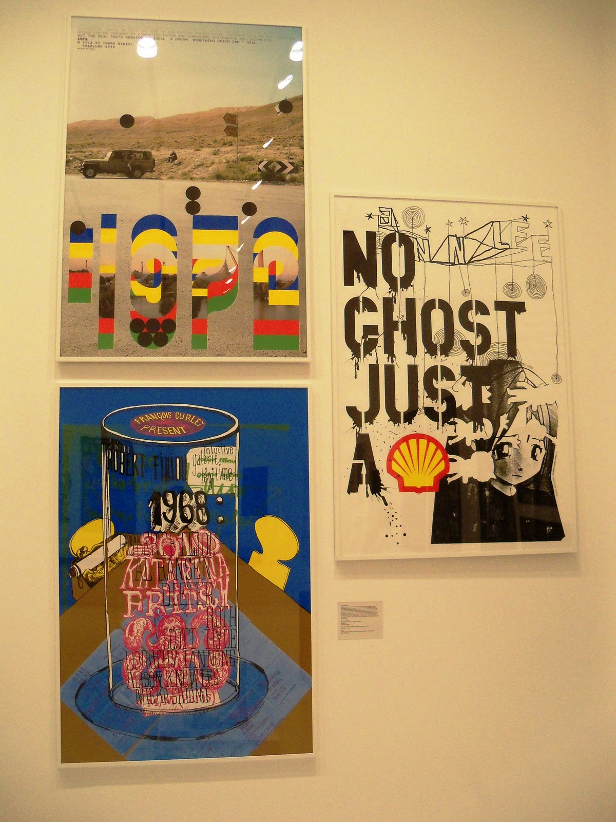
- 1972 A film by Sarah Morris (2008), Paralax Films
- Francois Curlet: Intuitive Galerie Le'gitime poster (2010)
- No Ghost Just a Shell [Pierre Huyghe and Philippe Parreno] (2000)

- Craig Ward and Sean Freeman, The Future (2008)
- Craig Ward, You Blow Me Away (2009)
- Craig Ward, Super Collider (2010)

Eric Ku:
Chair/Chair (2009)
...is made from pieces that when taken apart, spell out the word 'chair.' Ku was inspired by a famous work by conceptual artist Joseph Kosuth, One and Three Chairs (1965). Kosuth places a new chair in the gallery next to a photograph of the same chair (photographed in that gallery) and a definition from a dictionary.

At the end of the day, everyone sat down for a nice chat reflecting over the days tour. We shared our experiences touring over 5 different places combining two of our classes' trip on the same day.

And that concludes our trip for the day. Hope you enjoyed my blog ... and I want to create more of these.
No comments:
Post a Comment